NGUYEN NGOC VIET SANDWICHES
-
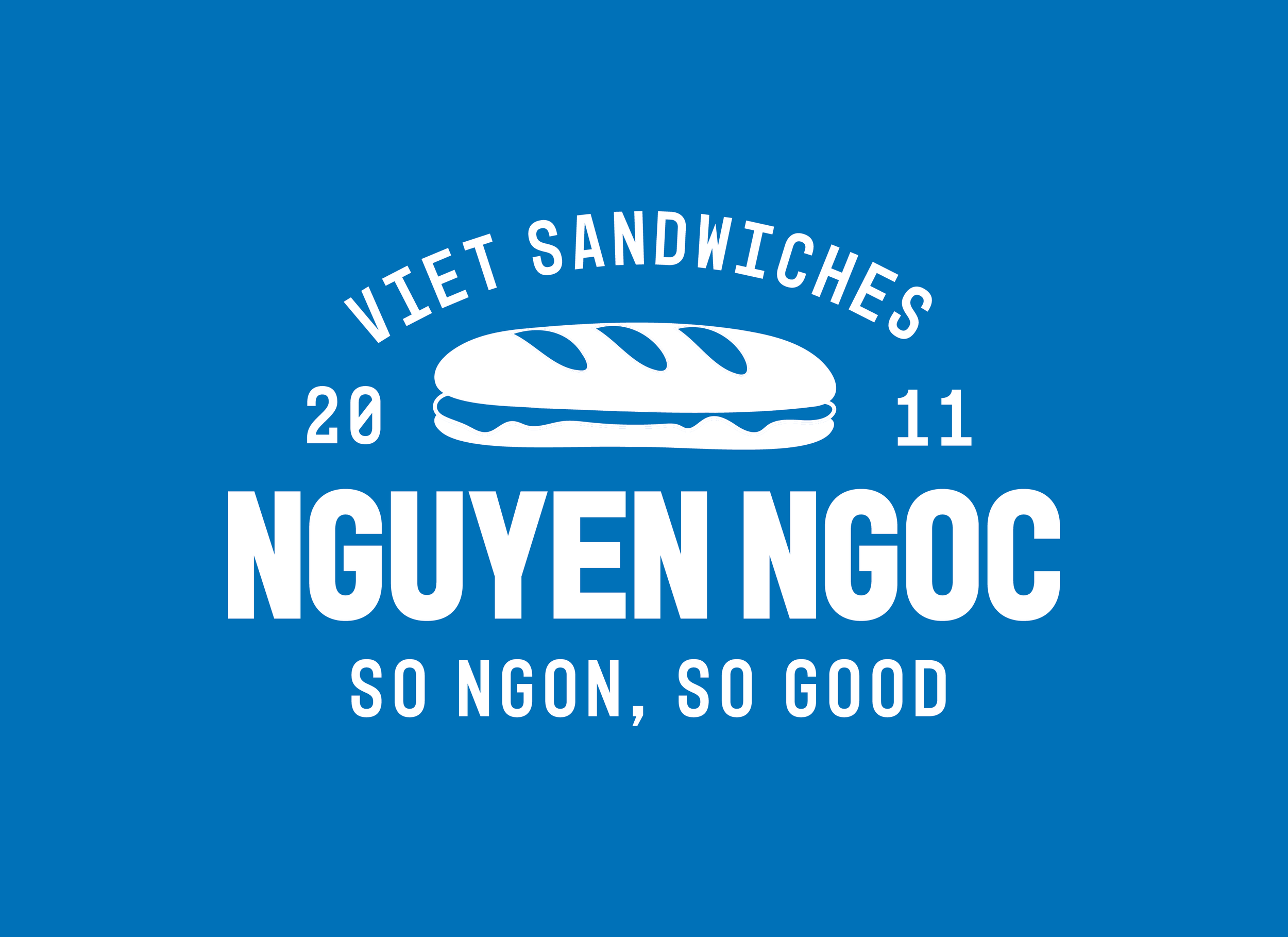
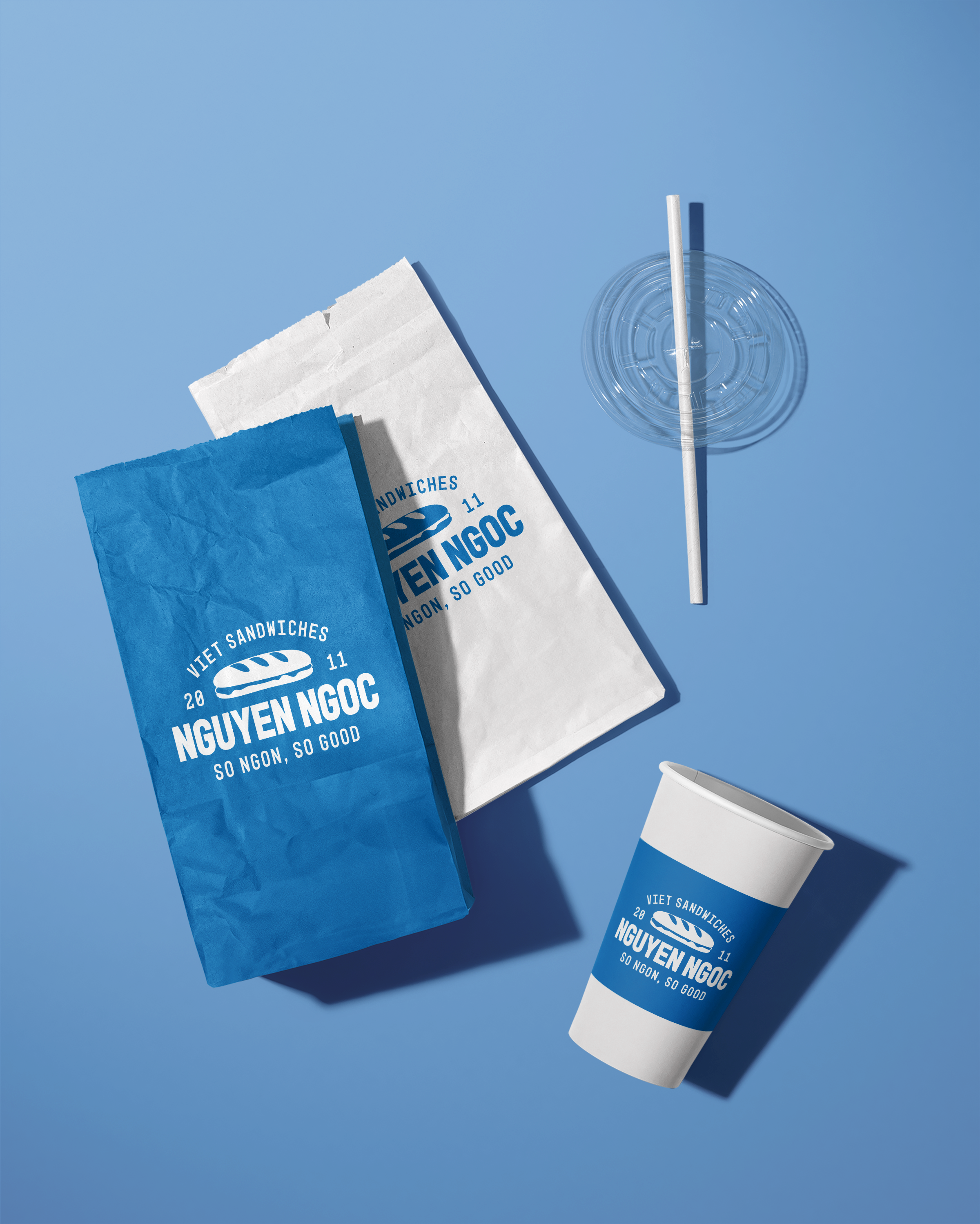
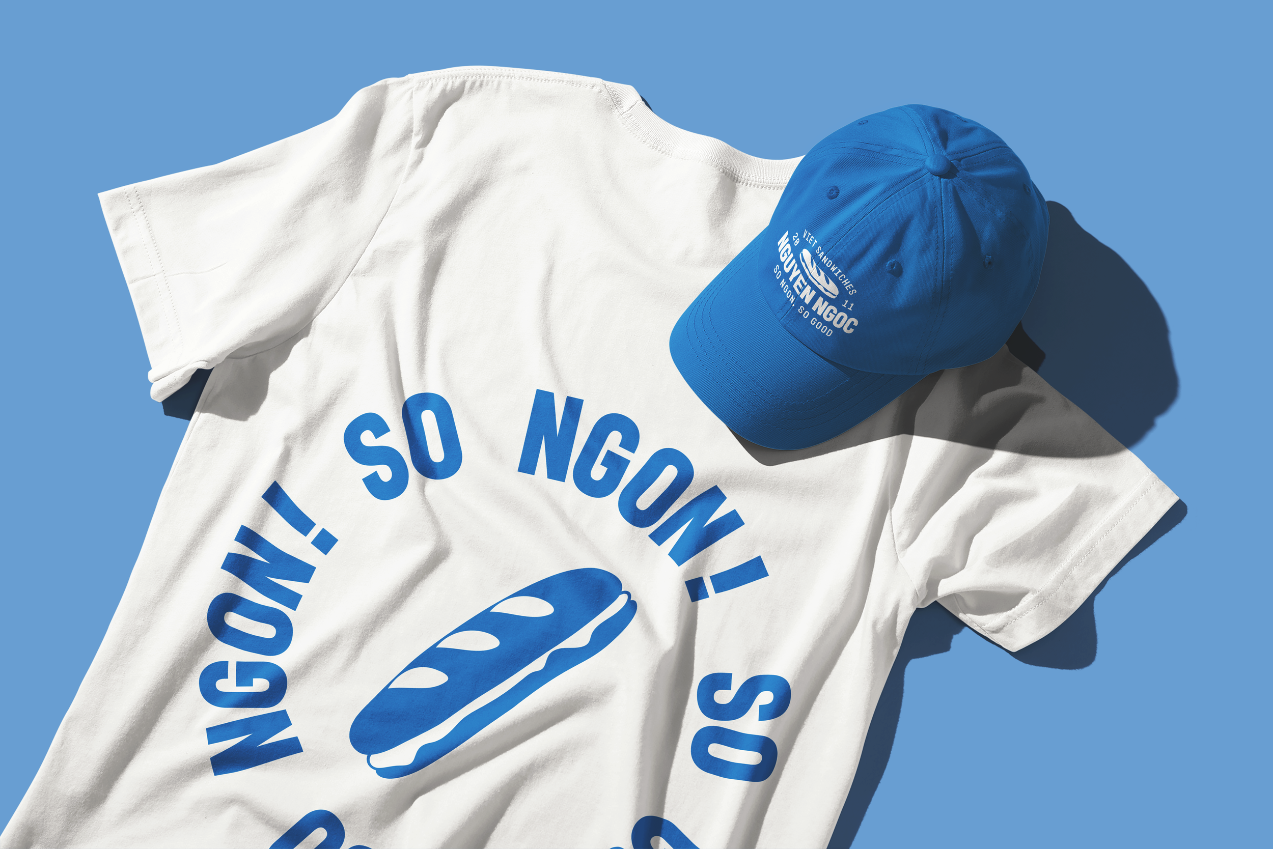
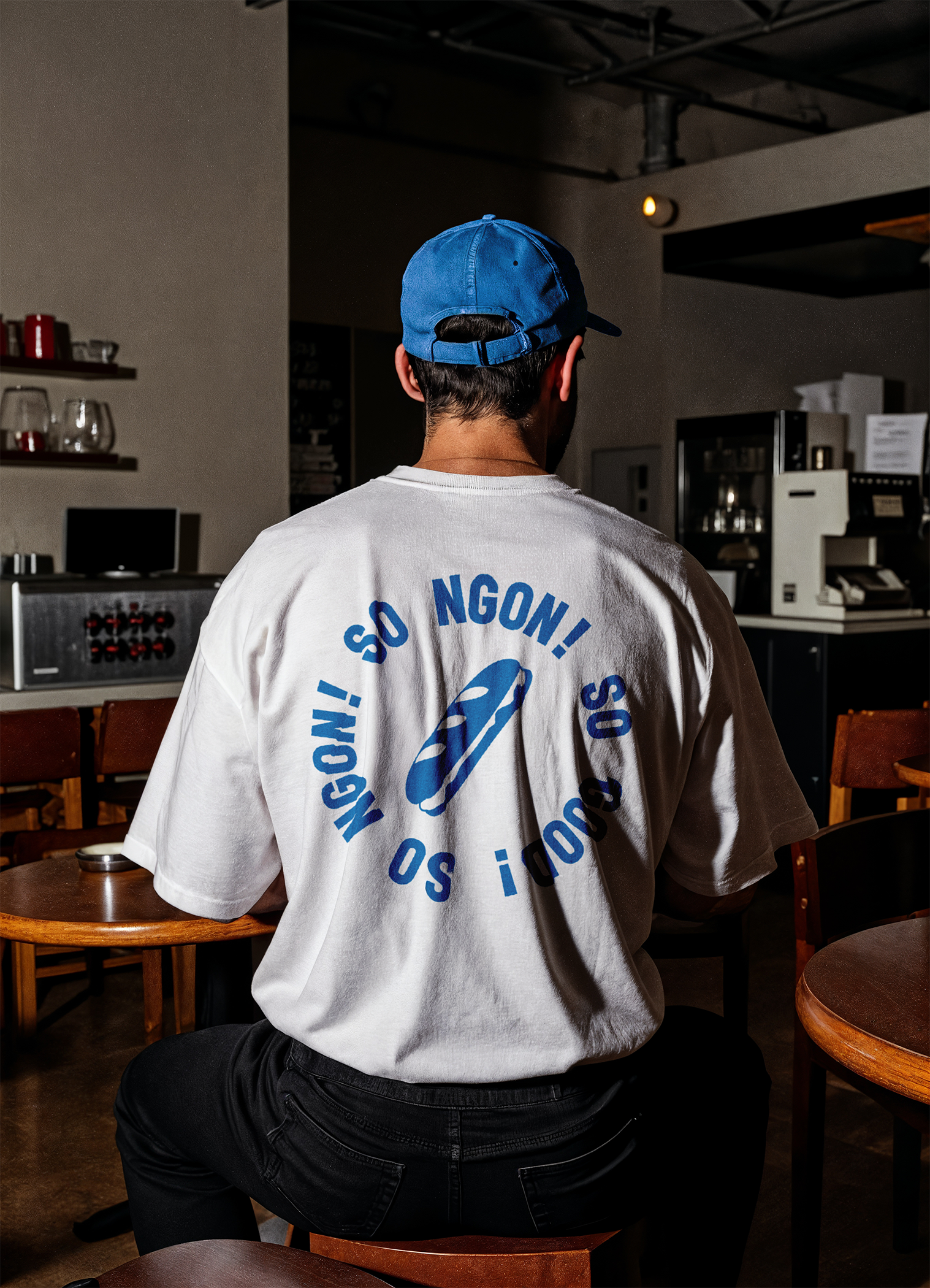
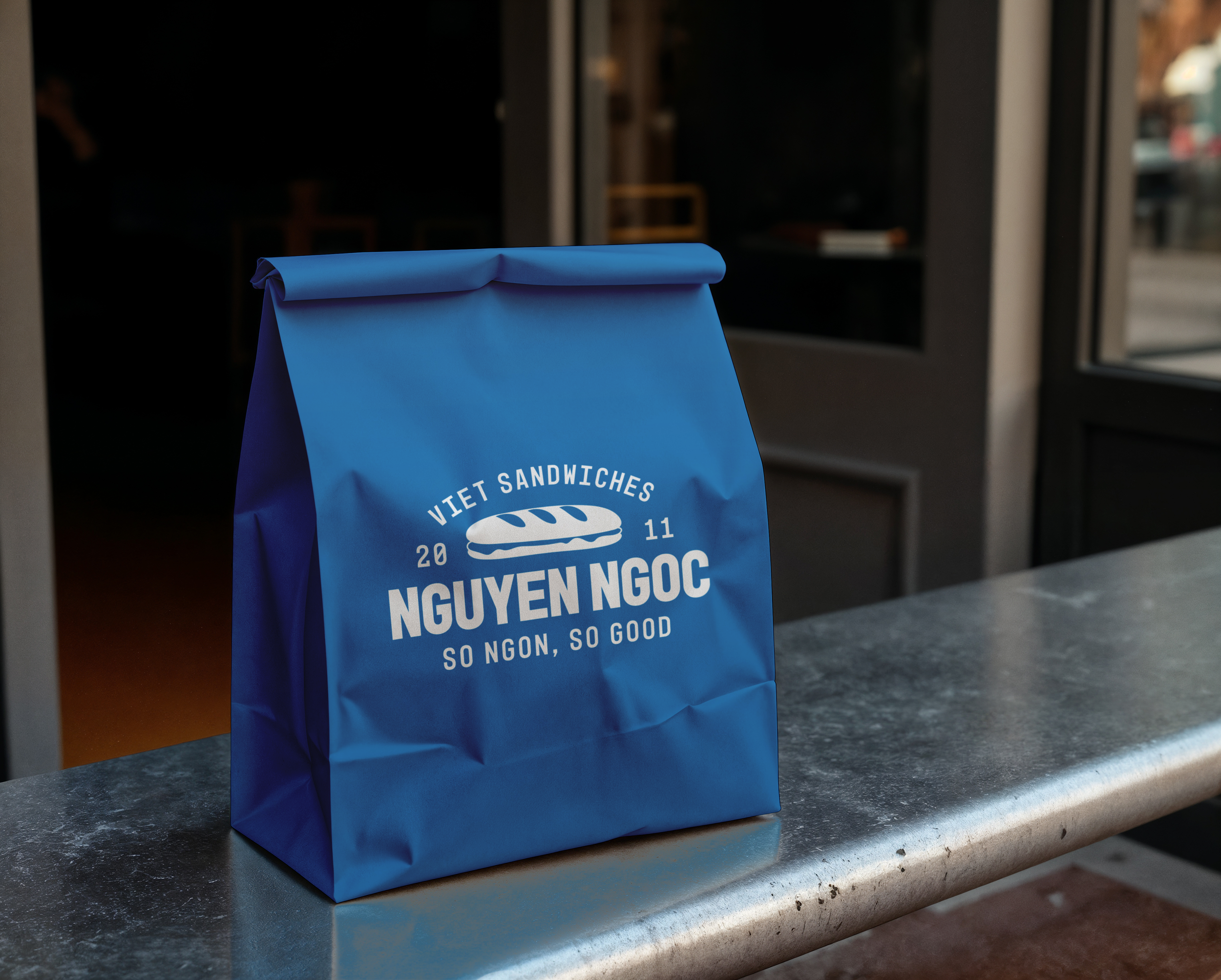
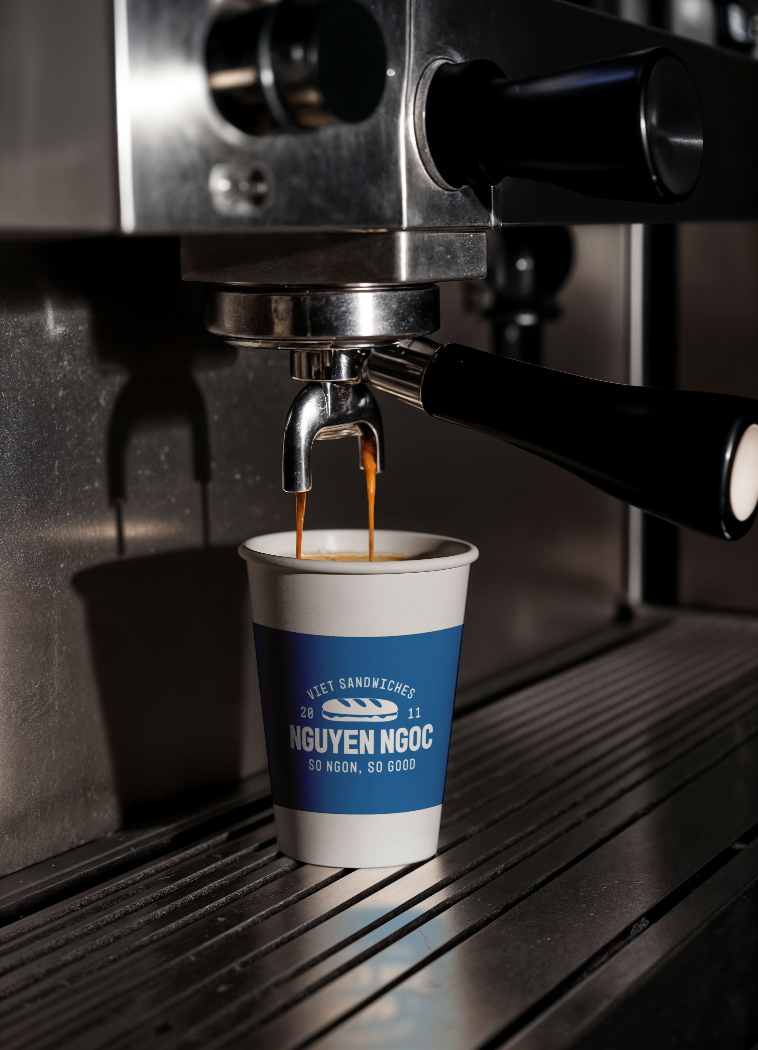
A rebrand of a local Vietnamese sandwich (bánh mì) shop established in 2011. Nguyen Ngoc’s new identity combines bold typography with a clean, vector-based bánh mì icon, anchored by the playful tagline “So ngon, so good.” The refreshed logo and packaging introduce a modern palette that moves away from the shop’s original red to help it stand out among local competitors. The new look keeps the mom and pop authenticity intact while resonating with loyal customers and appealing to a broader audience of young and adult diners.
-
Type: Logo, Brand Identity & Packaging System
Software: Adobe Illustrator, Adobe Photoshop
Awards: Best Logo Design - Honorable Mention, SHSU 2025